Reverse screen recording, AI language removal, and the return of a UI design trend
AI should remove language
When we think about AI computers of the future, it tends to go like this:
Ugh, computers are so dumb
Humans are smart
We should make computers more like humans
We should just be able to talk with them
It would be like hiring a smart person for free
We never have to work hard again!
Here’s a quote from Sam Altman, OpenAI CEO
"You should be able to write up a few pages of here's what I want, here are my values, here's how I want the AI to behave, and it reads it and thinks about it and acts exactly how you want because it should be your AI."
It's interesting, and it feels visionary. But something's off. Do we want to think of the next big era of computing like this: "It's going to be like having a human assistant"? Are human skills the end point of our imagination? What if large language models (LLMs) could help us use less language, not more? The thread kings on Twitter are all like, “listen up! If your UI isn’t AI-first [just a text field or worse, a microphone] in 2023, you’re in a bad place!”
Sure, LLMs make chatbots better, but it doesn’t change the basic fact about our brains: it’s terrible with language. Language is a single-threaded brain feature and a relatively new biological launch. As a result, you can only deal with one stream of words at a time, be it from the text on a screen, phrasing your sentence, or hearing someone say something to you. And that’s a problem.
While processing language, you’re deaf, blind, and numb.
If the first human appeared ten years ago, language was introduced 20 months ago. We have the craziest capabilities to combine senses, process signals, and spot patterns. If your UI is to “write up a few pages,” this capability goes to waste. Go for a walk in a forest and see for yourself: billions of data points fly in your face and are immediately processed by your brain—yet you spend more brain cycles turning to your friend saying, “ah, this is so relaxing.”
It’s time to brush up on Weiser and think about how LLMs could remove language from the UI and think about language as a low-bandwidth glue between people, people and computers, and computers and computers. But the end-user experience should be more than that. Give us particle systems with millions of data points, sortable, searchable, filterable tables, visualizations, images, videos, haptic feedback, and audio with rich, embedded data, and package it all up in beautiful animations. Make data as enjoyable as a pop song; heck, present data as pop songs. We’re humans. We can handle it.
Demo 1 — Reverse screen recorder
When you’re recording your screen, you often redo the same recording repeatedly until it’s perfect:
Hit record
countdown timer,
try and make your demo,
Fail and start again.
If you’re recording a bug, you have to recreate the environment. What if you could rewind and grab your clip from the past? I had some fun playing with ReplayKit’s rolling capture. The SDK is a bit flaky (I had to reboot twice while developing), but the recording part of this demo was three lines of extremely simple code, and the clip export is often around a tiny 3ms!

Demo 2 — Reorder and remove
Ever wished you could default to Following in the new Twitter tab bar? That’s coming. Until it’s here, I overlaid SwiftUI code on a screenshot of Twitter. It was a surprising amount of work, but I learned a lot. Here’s the code, and here’s the demo:
Demo 3 — Linear.app-like gradients
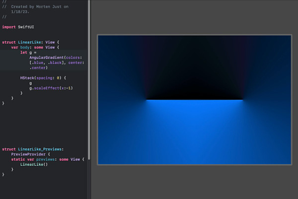
Linear’s delicious website is now the site everyone wants to copy. But how do you make that gradient that looks like a neon light in a back alley? I saw this tutorial on making Linear’s gradients in Figma and decided to try it out in SwiftUI. Unlike the Twitter UI demo above, it was literally a few lines of code, so I messed around with it some more and ended up with a big fat skeuomorphic button.


.
Is UI skeuomorphism back?
You know, it's funny, back before iOS 7, I used to have heated discussions about skeuomorphic graphics, especially the iPhone. The only argument I could buy was that it was a great way to introduce a whole new technology, in this case, a smartphone, to a broad audience, using physical-like materials and charming real-life objects they already knew from their own home.
But these days? I want it back. Or let me clarify; it’s not the skeuomorphism I want, but the craftsmanship. UIs that go beyond features, making us feel something beyond just getting stuff done.
Here's the woven background image from iOS circa 2011:
And here’s a Browser Company designer arguing that their mobile version should go full skeuo, and Jordan Singer remembering the Kickoff app, which has that wild page curl that revealed settings. Dribbble is also catching up, as in this weather app with split flaps and physical buttons.
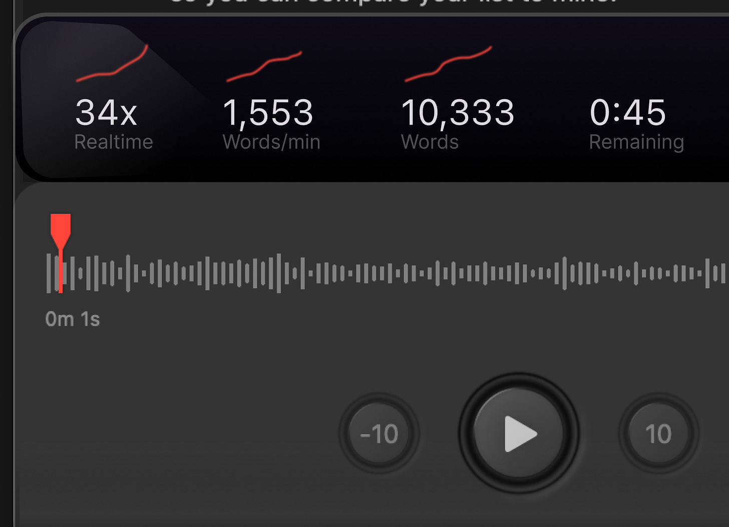
I’m also playing with a skeuo-like UI for an app that transcribes speech in audio with Whisper. More about that later, but here’s a sneak peek. I made the three buttons based on a dictaphone from Sony.
I click on things
3D rendering on the web. Check out this smooth mockup rendering made with Spline.
Does your trackpad zoom stop working from time to time? You’re not alone! There might be two cures: enable/disable pinch/zoom in Settings or kill the Dock (killall Dock). Here’s a menu bar app that does the latter,
How do SVGs work? I tend to forget that SVGs images are made out of code that you can generate relatively easily. Here's an interactive guide to understanding the SVG format and syntax. Looks fun!
Bézier curves. Right? Ever wondered how they actually work? The Pen tool in Figma, Illustrator, or Paths in SwiftUI. This video does a great job of removing the madness from the math.
High-quality SwiftUI components. There's a new version of Pow out from Moving Parts. That reminded me of this series of episodes from Swift talk where one of the Moving Parts engineers, in painstaking detail, describes how they make high-quality reusable components in SwiftUI. The Swift Talk series is just fantastic in a sea of beginner tutorials.
Split-flap in SwiftUI. Liked that weather app I linked above? Here’s an example of how to do it in SwiftUI.
Hit reply now and tell me what you’re thinking right now.


